
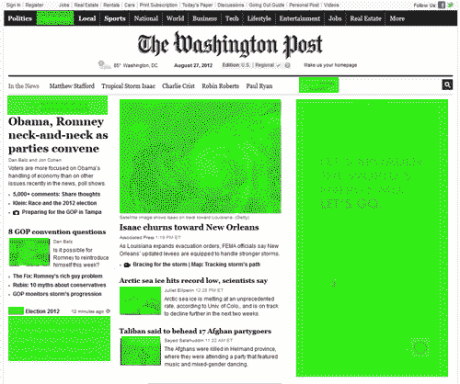
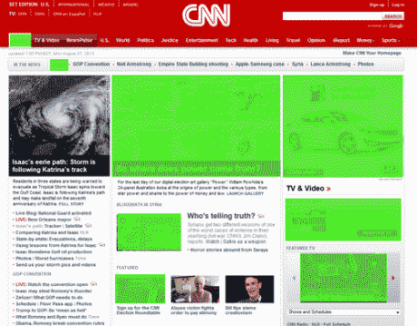
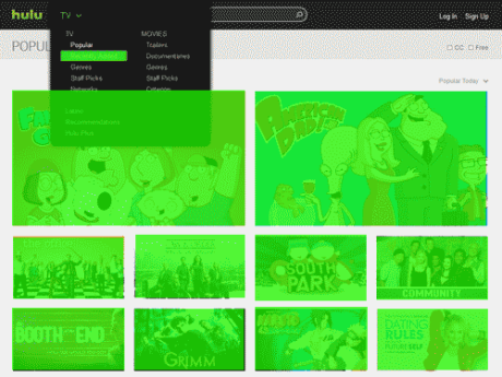
The rectangle is the most widely used shape in interface design. If you look at most websites you will notice that the buttons, photos, and advertising are displayed using rectangles. This is because rectangles are suited for long horizontal text of varying size while leaving space to include an image with text.
So many rectangles! In the examples below, rectangles are highlighted in green.
Oval and circles are uncommon for menu design for two main reason: (1) they have uneven surface areas within them that make text placement and image placement restricted to the center of the shape, and (2) they take up the same space as a rectangle of the same size but they have less usable space within the shape. In the examples below, the placement of “home” anywhere other than the center creates an unbalance look because of the oval’s curves that do not mix well with the invisible straight horizontal line that the type sits on.
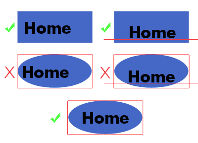
This is not to say that ovals and circles are never used in GUI design, they can be used effectively, but that they are naturally suited for short text and images because of their dimensions and limited space.
When aesthetically appropriate, using circles and ovals can contrast nicely with rectangular shapes and act as a design tool that can be used to call attention to specific buttons, such as a key pad, or better suit a particular brand, such as a children’s museum’s kiosk. Circles and ovals are thought to be the first shapes learned by children because they have no corners and are one-sided making them easy to learn and recognize.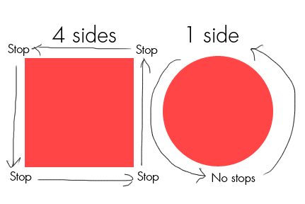
In the example above the square’s corners act as a visual stop sign to the viewers eyes as they have to reorient themselves to the change of direction in the shapes sides, but the circle has a continuous curve that has no visual halts which allows the viewer’s eyes to circle around repeatedly.
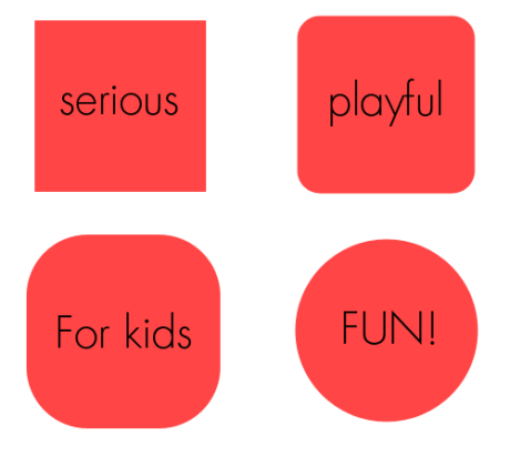
Hard-edge shapes are more serious and adult like while soft-edge and round shapes are more playful and appealing to children. Nintendo, Mattel, and Lego all use circles, ovals, and round-edged rectangles on their websites to create an appealing user experience for youth visitors while accurately representing their brand.
How to use shapes effectively.
For example, you could pair rectangular buttons with circular buttons to strategically call attention to specific areas of the GUI. By making the page buttons rectangular and the sub-menu buttons circular, users can quickly differentiate main menu and sub-menu information by shapes alone, and when combined with the other methods of guiding users (color, size, grouping) the GUI can achieve a very user-friendly approach.
Always learn. Question everything. Be awesome.
GN
